Search in UX
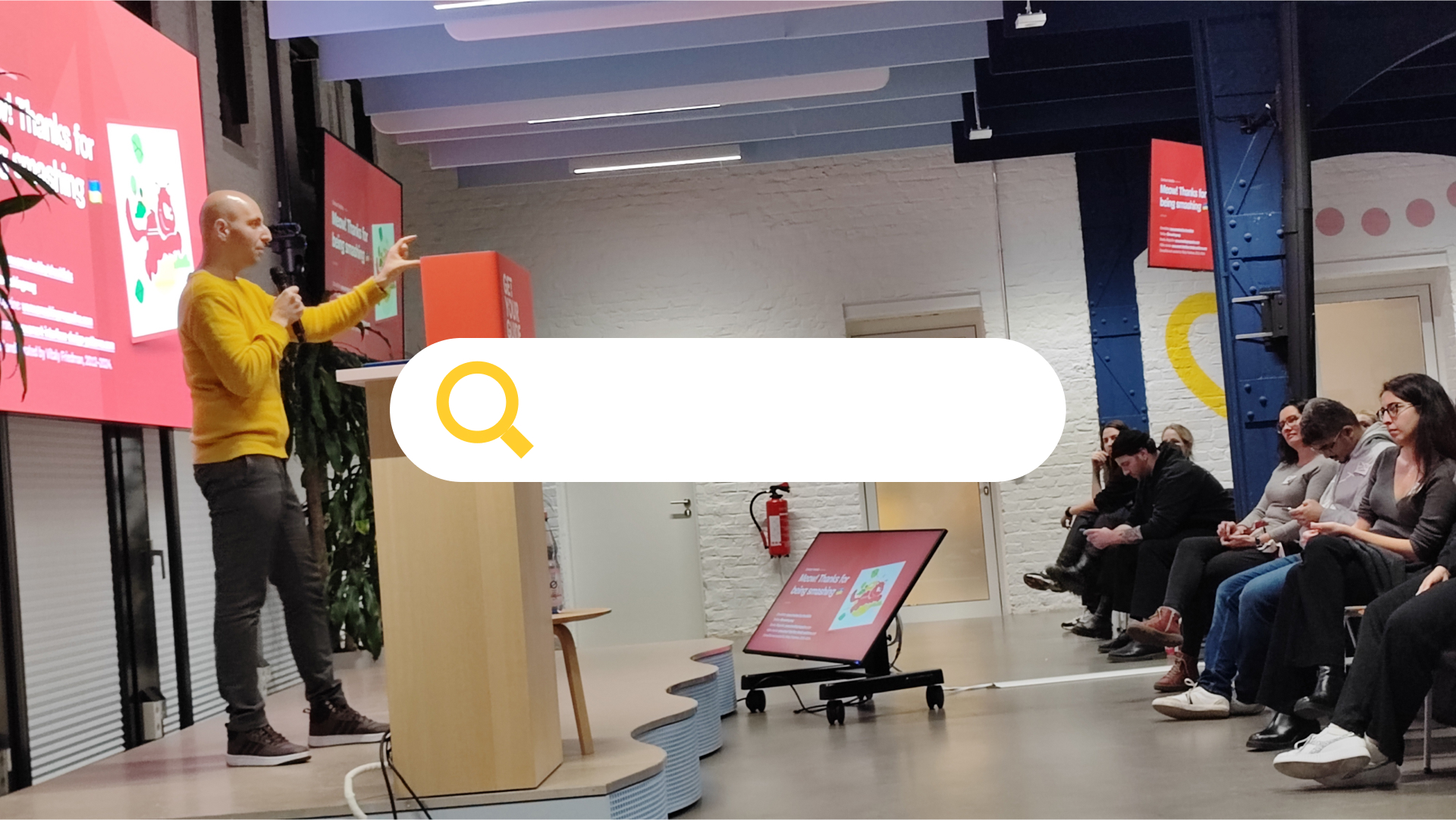
Very recently I had the opportunity to attend a talk of Smashing Magazine’s Vitaly Friedman about the state of UX in web search – a highly interesting and very often overlooked topic in product design, web development and even interface design.
More People have been to the top of Mt. Everest than to page 10 of Google’s search results - Vitaly Friedman, Smashing Magazine
When approached about adding a search function to their site, I usually tell people: Either you do it right, or you don’t do it at all. Nothing is worse than a bad website search (or result page). In fact, search could even become its own product discipline. Chief Search UX Officer. Who wouldn’t love that?
Here are my takeaways from Vitaly’s talk:
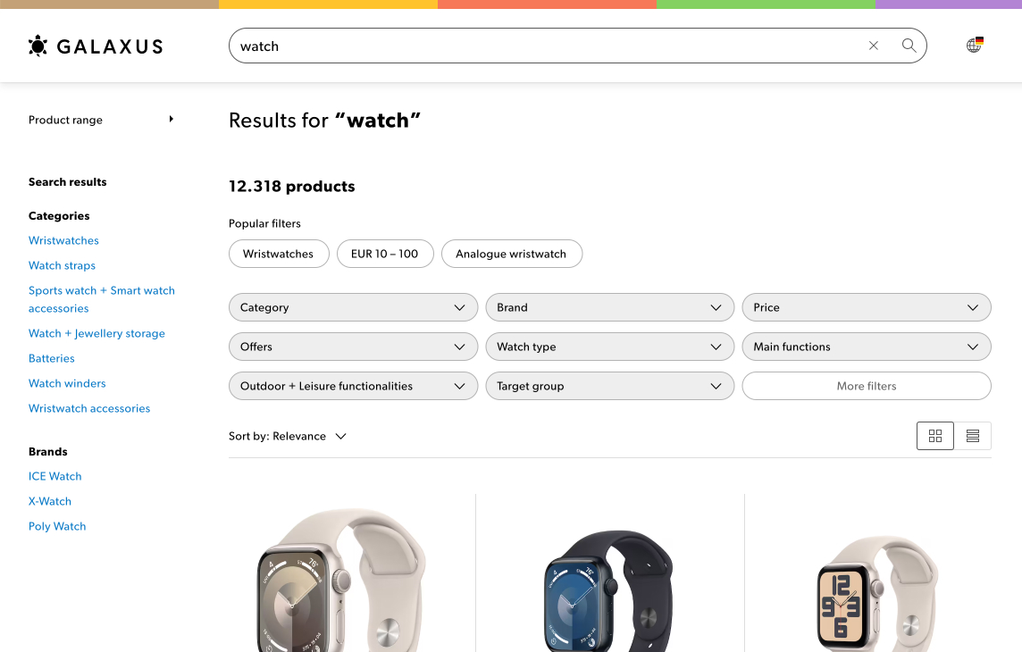
Search, Filter, Sort
A search box never comes alone – when users perform a search, they also expect to filter and sort the result list. Of course, in that order: Search first, filter second, sort last. The more complex your list of results is, the more filter options we expect. Vitaly showed with an impressive from shopping platform Galaxus how this should actually work.
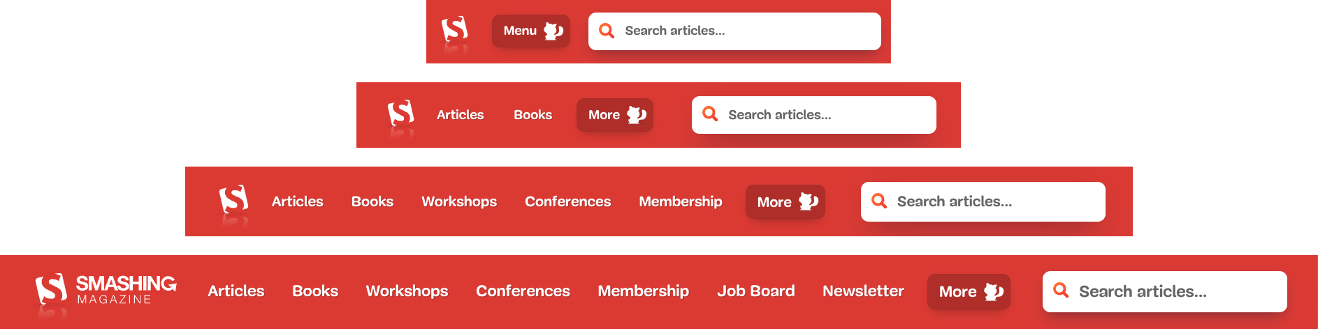
Don’t hide your search bar
While it is tempting to hide the search behind a magnifying glass icon (and of course easier to design for), making the search bar a part of your navigation will increase your search traffic and conversion significantly. An example from Smashing Magazine showed how the bar would always be visible, prioritzing the search bar in all viewport sizes and through all device types.
Show diverse results
The top 3 results in each search will get the most attention – and roughly 60% of the clicks. So instead of just sorting result list items by keyword relevancy or recency, try to display a diverse set of search results in the beginning instead of very similar items. This will make it easier for your users to make an informed decision and will increase the perception of your search results being well-balanced.
If you offer different types of search results, e.g. Pages, Downloads, Products, Events to name just a few, cluster your results to make it easier for your user to find the expected result. Because:
People pinball through search results
Instead of scanning results in a linear way, user research has shown that people will «pinball» through search results, jumping from keyword to keyword, scanning for the desired result. Even more: we tend to look for source url, result type and relevancy while reading a result page title line.
The interesting learning: It is not crucial anymore to be on #1, but to be within the first viewport (Top 3-5 results, depending on layout) to be considered in the users decision.
Manage expectations in pagination
This is probably my favourite learning: If you need to show multiple pages of results, give people an idea what they can expect on each page. For example: If you display a list of shoppable products and you sort by price, display the price range of the products shown on each page. More common: if you sort in alphabetical order, show which starting letter can be found on which page. Honestly: This would have saved me so many hours on so many sites, I think this should become a standard.
If you want to learn more about the topic, check out Vitaly’s talk summary on smashed.by/search-2024.