Mobile Design Trends in 2020

This article first appeared in the print issue of t3n #60 in German language. Read part 2 of this article on the Human Deluxe Toolbox
UX Design is ever evolving. In today’s global and restless society, technical and social changes trickle down into product design very quick. Almost daily.
The most important ones don’t affect visual trends: Is red this season’s color? Or is it cyan?
Also, forget about evergreen trends like big fonts, fullscreen images or background videos. Those have been “trending” for the last ten years, and will still be on design trendlist in a decade from now.
Instead, let’s look into some different trends that focus on two things: easy and intuitive usability.
Juicy Illustrations
Illustrations in UI design and branding have worked their way up from being associated with kids apps to becoming a staple in business brands and tech startups. Dropbox, Microsoft, IBM – you can find them almost everywhere.
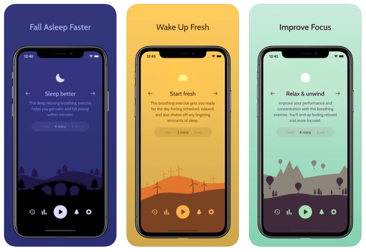
One thing most of these flat illustrations have in common: They serve a rather decorative purpose. This is, until you look at Unwind:

The meditation and awareness app Unwind uses fullscreen background illustration that are different: They change while the user interacts with the interface. Illustrations have become an integral part of the user interface with apps like Unwind.
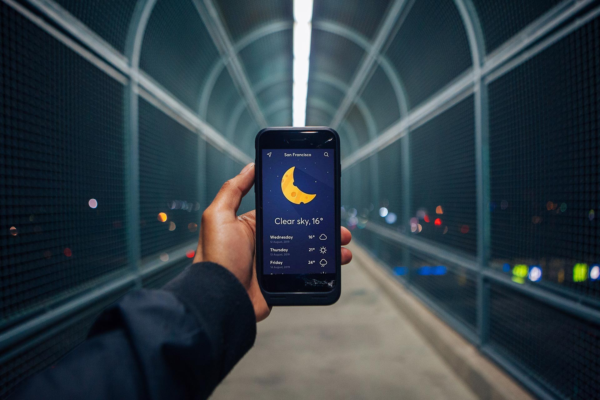
This is a trend in 2020: We will see more an more apps using illustrative elements that drive emotions and pull users into their world. Switches that change background based on state, weather apps that use cheesy moons and lemony suns. There is no limit in fantasy.
The overall style gets a bit more daring: Emerging from the flat world of business vector graphics, we will see more gradients, playful ideas and vibrant or pastel colors. There’s a lot allowed, as long as they do one thing right: Help the brand stand out and retain users through emotional engagement.
Meaningful Gestures
Pull to Refresh – when Twitter (or third-party app Tweetie, to be exact) introduced this gestures, it was revolutionary. When you’re at the top of a list, you take one finger, pull the list down and let go to load more content. Today, almost every feed- oder list-based app uses a form of pull to refresh.
This gesture is so successful because it mimics a real world gesture: Some psychologists see parallels to Las Vegas slot machines: You pull a lever and get random, new results. Repeat. Repeat.
Today, meaningful gestures are a very important design trend: The famous Tinder swipe is a more important than the networks logo. You get a stack of pictures in the middle of your dating app, and by flicking them left and right you decide which one’s you want to get in touch with and which ones you don’t.
This meaningful gesture is so closely associated to the brand that other apps that are using it describe themselves as Tinder for Jobs, Tinder for Pets, Tinder for … you get it.
Classical Music streaming app IDAGIO introduced a mood selector, which reminds users of the good old iPod days. On a Jogwheel-like experience, the user chooses the music they want to listen to, based on their current mood.
Pushing, Pulling Spinning – there is a lot of opportunites still to explore in meaningful gestures. Using real-world metaphors let’s users “work” for their desired result and makes it easier to remember the experience – and making the interaction a part of the brand.
Part 1: Juicy Illustrations & Meaningful Gestures